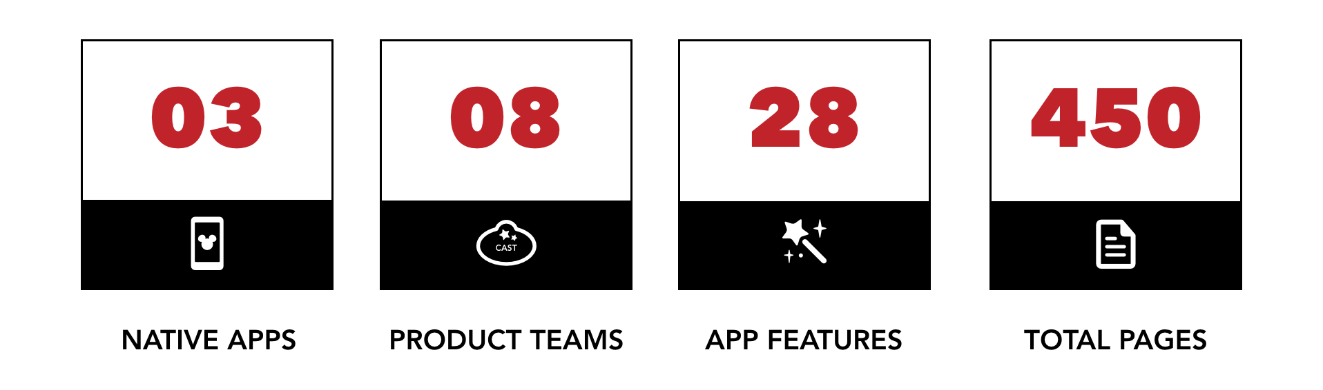
Roles
I lead four design teams through a multi-year effort of scaling the Walt Disney World Mobile App, introducing a modern navigation and design system. In my role, I led the design process, executive alignment, and launch readiness of the redesigned app.
Strategic Lead•Principal UX Designer•Design Operations•Career Mentor•Skills Mentor
Responsibilities
I oversaw ownership of four foundational sections of the Disney World app. I formed and managed tactical design teams which built a dynamic home screen, a global app navigation, created a scalable view model, and centralized reservation bookings.
Design Strategy•Executive Alignment (VP + SVP)•Prototyping•Production Design•UX PM•Information Architecture•Established Design System•Design Process•User Research•Accessibility Compliance•Design Sprints•VP Level Workshops•UX Conference Presentation
Introduction
In 2015 Disney Parks launched its first generation Disneyland App (DLR), internally referred to as the Platform Experience.
The goal of the Platform Experience was to create an ecosystem of native applications that shared a foundational code base with re-usable design and technology libraries. Disneyland piloted the platform architecture due to its smaller, more manageable physical size and digital feature set.
Bringing Walt Disney World onto the Platform
By late 2016 early 2017 the native Walt Disney World app, titled My Disney Experience (MDX), had launched numerous features and updates and had begun to outgrow its first generation architecture. The original experience used many native components that underwent countless minor customizations and the effort to sustain and align to the Disneyland App feature set became exponentially inefficient.
Using the Platform Experience Libraries, I led a small team of designers to convert the existing features of the My Disney Experience App to the visually and functionally align with the current release of the Disneyland App. Within 6 months of going live with the new design, and after more features were added to ecosystem, and it became clear the architecture of the smaller park experience couldn't support the feature set of a larger park.
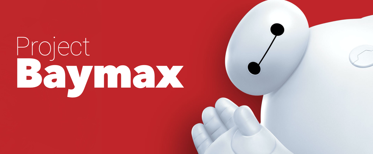
Enter Project Baymax...
Navigation Patterns
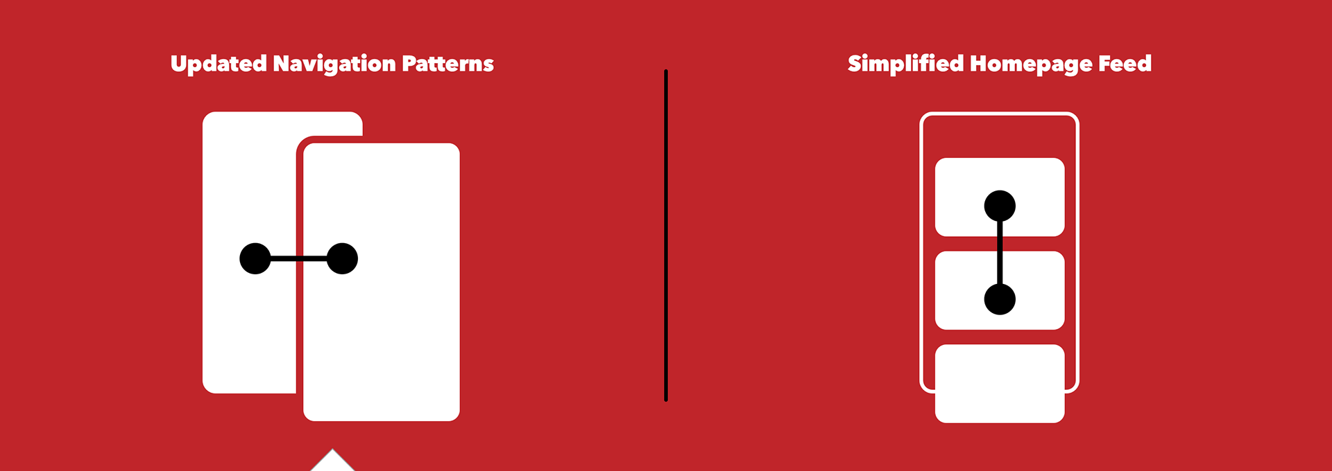
The original architecture of the Platform Experience relied heavily on custom build "levels". The first level acted as the base and was reserved for the interactive park map. As guests navigated through features of the app, each new view transitioned from the bottom of the screen as a new level. Issues arose when each feature implemented their flows as an isolated levels, resulting in levels stacking on top of each others indefinitely. This resulted in guests quickly getting lost in a stack of views they would manually have to swipe from the top edge of the device in order to close each. This usability concern was compounded when both iOS and Android updated their OS to include a utility drawer accessible via a swipe from the device's top edge.
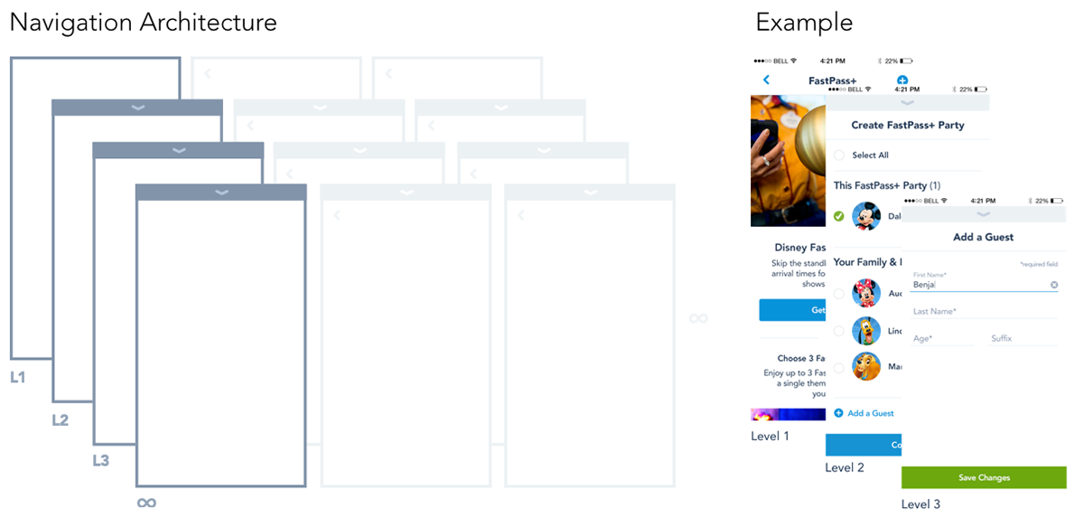
Keep It Simple
With such a complex ecosystem, the goal was to clean up the core navigation pattern in a way that required minimal involvement from the feature teams to retro-fit while also adhering to a common practice that was familiar to users and required minimal custom sustainment. Minor updates to the close control were made and a maximum limit of 2 layers was put in place to make the update cost effective and simple to advocate to our partners. Our users were already familiar with the pattern, so the update was received as a UX improvement and was well received by both the business and end user.

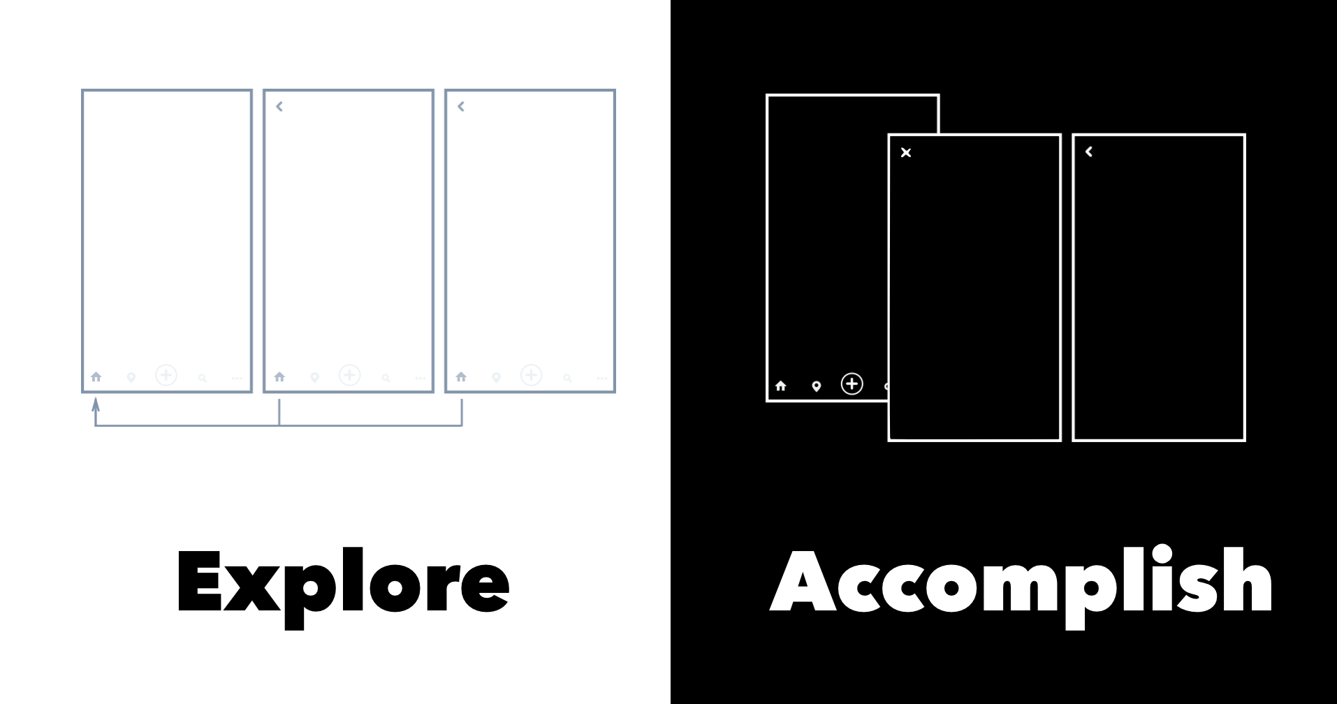
Feature Elevation
In addition to simplifying the level systems, the screens comprising the base foundation also needed to expand beyond just the park map. There were simply too many features in the app to all originate from a single view control. To address this need, a tab bar was implemented to separate global features from contextual actions.


Welcome
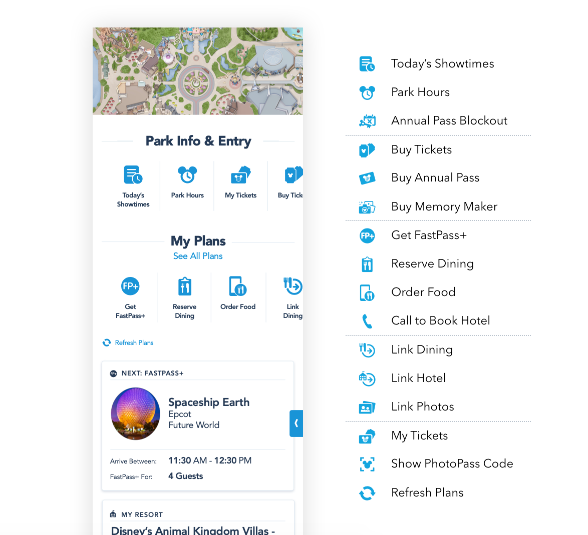
Home
Home
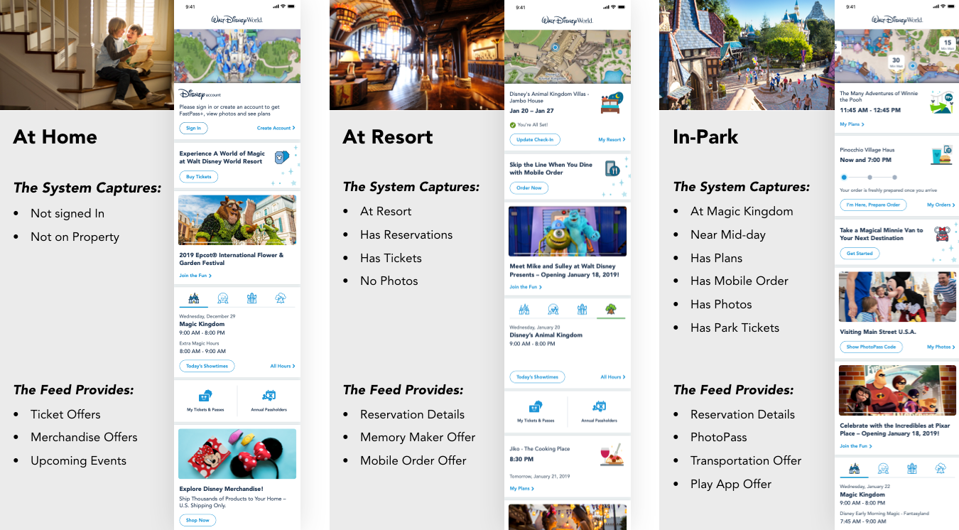
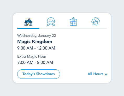
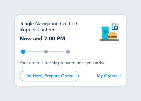
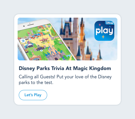
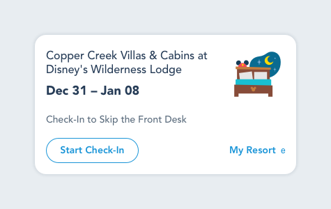
The home screen became the primary starting point for the ecosystem, and provided users with a news feed and personal in-the-moment content. This required a collection of dynamic tiles that could accommodate a range of information and actions all with a shared visual style.
The view was powered by machine learning which determined the order of the tiles as well as the content within and re-prioritized the data at key thresholds, such as the user going from at home to a Disney resort or one of the four Theme Parks.